Redesigning The Infatuation’s Core Experiences
The Infatuation is a restaurant discovery platform that helps people find their new favorite spots in town. Known for its witty and irreverent editorial voice, the brand has built a loyal fanbase of readers who trust its recommendations. But while the content had personality, the experience of using the app and site felt dated, especially as people increasingly turned to AI summaries and social media for restaurant discovery.As Senior Product Designer, I led a year-long redesign of The Infatuation’s core experience across desktop, mobile web, and app. The goal was to modernize how people read reviews and guides, making the experience more media-rich, flexible, and scalable, while strengthening SEO performance in an evolving search landscape.
Problem
The core experience of reading The Infatuation hadn’t evolved to keep up with changing user behavior. The landscape for restaurant discovery was shifting — Instagram and TikTok surfaced short-form content, while AI summaries generated reviews and recommendations on the fly without directing traffic back to The Infatuation.
Goal
Update the reader experience across desktop, app, and mobile web to be more interactive, surface richer media, and improve SEO performance for users coming in through search.
This case study represents the broader body of work that went into redesigning the reader experience at The Infatuation. The project unfolded across many smaller, overlapping initiatives that evolved over the course of a year. For clarity, I’ve consolidated that work into a single narrative — but in reality, it involved ongoing iteration, alignment, and changes in direction between teams during a period of shifting design leadership.
Team
Will, Senior Product Designer
Grace, Product Manager
Sarah, Engineering Manager
3-5 engineers
Platform
Mobile Web
IOS
Desktop
Duration
1 Year
Discover > Define > Develop > Deliver
Discover
While at The Infatuation, I led a series of research initiatives aimed at understanding how readers experienced the platform and identifying opportunities for improvement. These included a UX audit, internal alignment sessions with editorial and product teams, and in-person user research at EEEEEATSCON, The Infatuation’s annual food festival.
1. Research - UX Audit
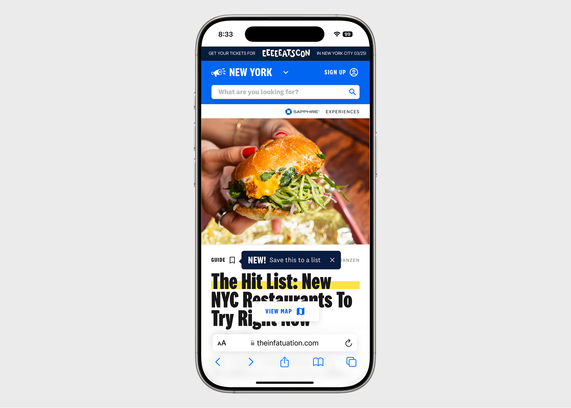
In my first weeks, I conducted a comprehensive audit of the review and guide experiences across desktop, mobile web, and app. I catalogued UI components, layouts, and interaction patterns to understand how readers engaged with content on each platform.
Findings
Mobile web — our largest and fastest-growing channel — was cluttered and inconsistent. Pop-ups, sign-up forms, and promotions dominated the screen, pushing key content like restaurant names and photos below the fold. Even once visible, reviews were sandwiched between competing product features. After showing the experience to a friend, his reaction summed it up: “This looks like spam. I feel like I’m going to get a virus on this page.” The reading experience was designed for desktop and retrofitted to mobile, where most users actually discovered us. Key content was buried behind banners and modals, creating friction for new visitors from search — a critical acquisition channel.
Impact
I proposed shifting to a mobile-web-first design strategy, fundamentally changing how we approached and pitched design work. We began designing for the smallest screen first, focusing on clarity, trust, and accessibility. I shared the audit findings in a deck with leadership and design peers, using screenshots and behavioral evidence to demonstrate how clutter was hurting engagement.
To determine what content to prioritize, I turned to the editorial team.
2. Research - Internal Card Sorting with Editorial Team
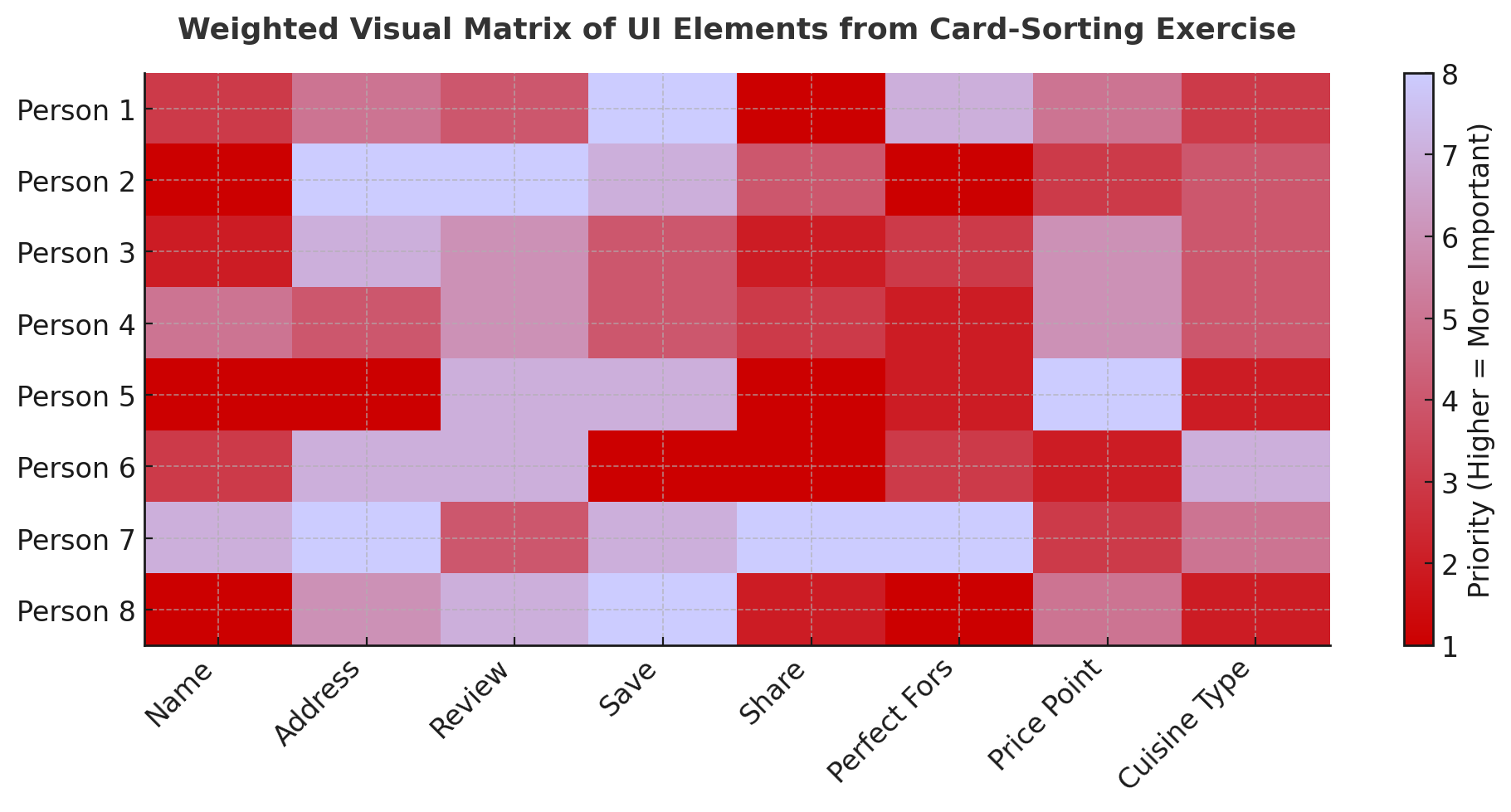
To balance editorial priorities with user needs and product goals, I ran an internal card-sorting exercise with twelve editors, writers, and product partners. Each participant was shown all UI elements from a review — metadata like neighborhood, price, cuisine, and tags, as well as interactive elements like save, share, and map. They ranked each item by importance to the reader, and I synthesized the results into a frequency-weighted hierarchy.
Key Insights
The team lacked a shared hierarchy for what mattered most to readers.Editorial wanted the story to lead; product wanted engagement features up front. On mobile, limited space required smarter prioritization — and opportunities for contextual display.
Impact
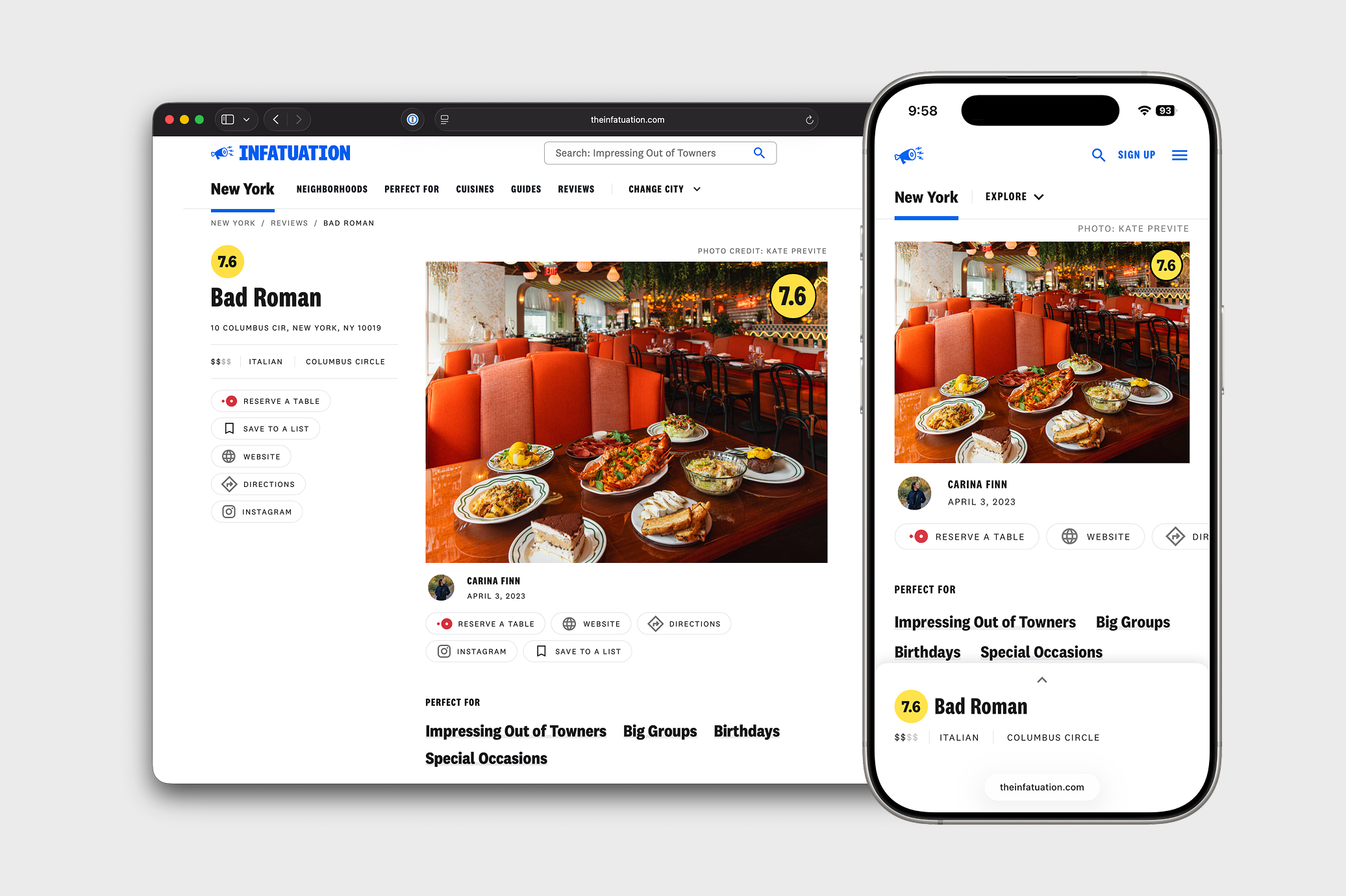
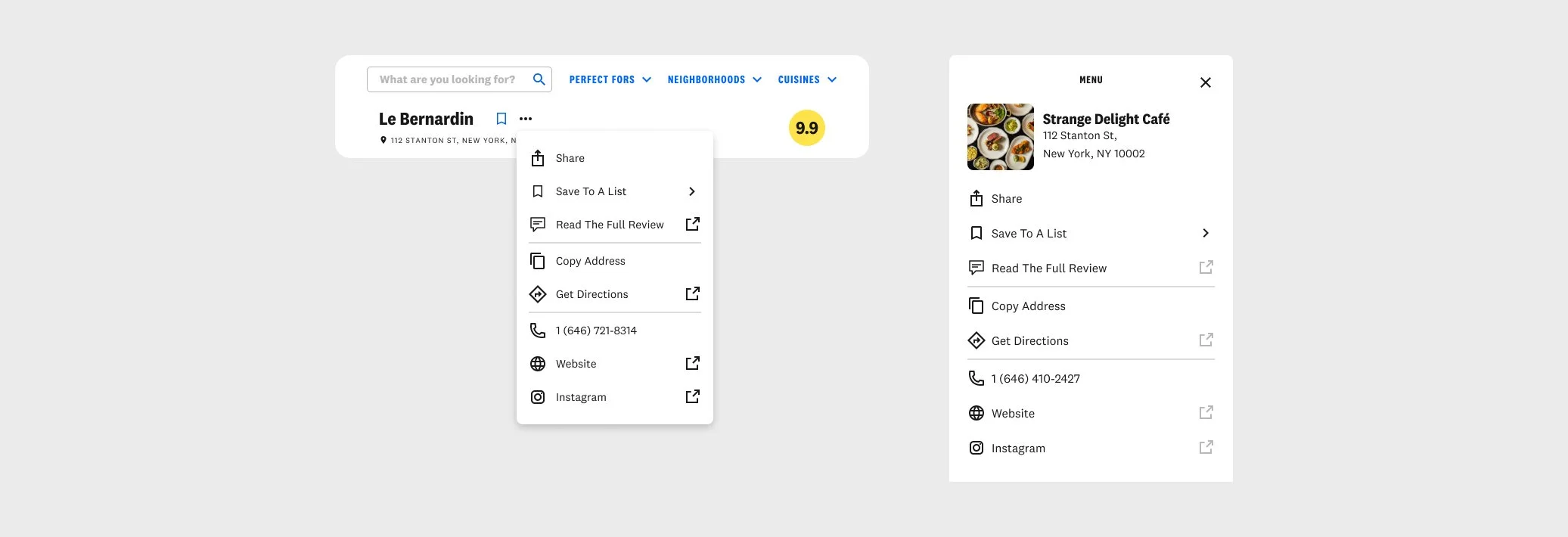
We aligned on what belonged above the fold versus what could appear on interaction. This work directly inspired Sticky Headers, a UI pattern that keeps core details — name, rating, save, and share — visible as users scroll while revealing secondary information contextually.
Beyond the design outcome, the exercise strengthened cross-functional relationships. Editorial, product, and engineering developed a shared understanding of how to balance storytelling with usability, making future decisions faster and more aligned.
3. Research - 20+ Interviews at EEEEEATSCON
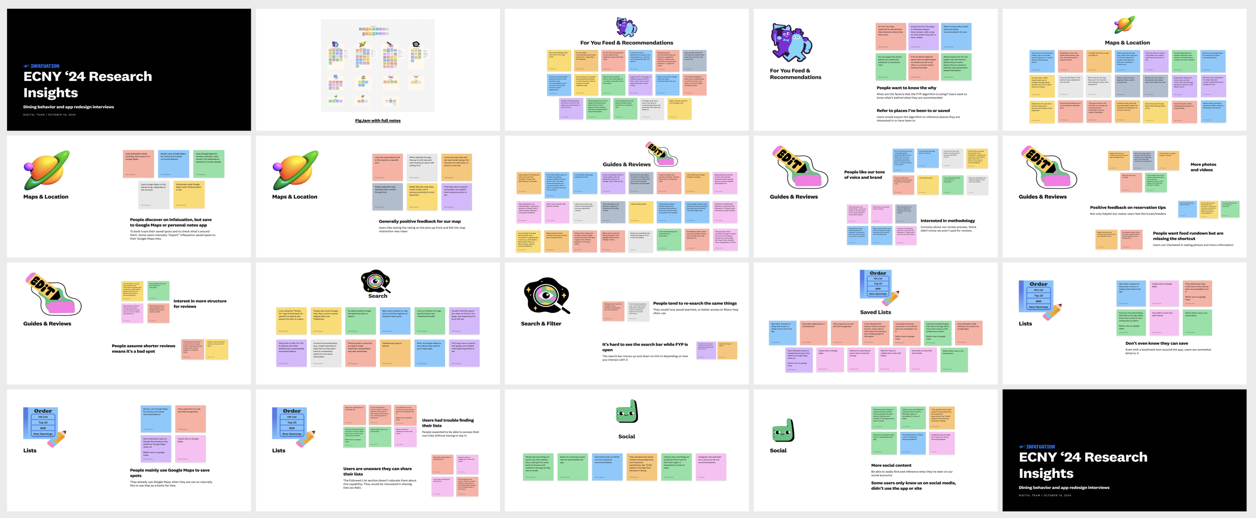
At EEEEEATSCON, The Infatuation’s annual food festival, I interviewed more than twenty attendees about how they discover restaurants, which apps they use, and how The Infatuation fits into that ecosystem. Each conversation was recorded, transcribed, and synthesized through affinity mapping into key insights, which I presented in a deck to design, product, editorial, engineering, and leadership.
Key Insights
Conversations reinforced the need for transparency, richer media, and personalization Users wanted to know why restaurants were recommended, expecting personalization tied to places they’d saved or visited. Many discovered restaurants on The Infatuation but used Google Maps to track them later. Readers valued our tone and credibility but wanted more photos, videos, and insider tips. Frequent re-searching signaled the need for better filters, saved searches, and list management.
Impact
This research validated earlier hypotheses about visual engagement and information overload, helping justify investments in features like richer media, search and filter improvements, and map-based interactions. It also reinforced the value of decluttering pages — confirming that hiding secondary elements behind interactions improved focus and usability.
Define
The research made it clear that people loved what The Infatuation said, but not how it said it. Readers trusted the brand’s voice but struggled with a product experience that felt static, cluttered, and dated. The opportunity wasn’t just to redesign pages, it was to bring stories to life through design. With the research in hand, I reframed the challenge into a few key questions:
How might we redesign reviews and guides to feel native on mobile web?
How might we make it easier for readers to find the information they want?
How might we introduce new media like videos and carousels?
How might we create a scalable layout that adapts to different content types?
How might we structure information consistently across desktop, mobile web, and app while giving editorial teams flexibility to tell different kinds of stories?
Approach
Throughout the design process, I kept returning to a few core ideas: streamline information for scalability, reduce clutter, create more ways to engage with media, design for flexibility, and make the experience feel native to each platform. These principles guided every design decision from how we structured metadata to how we introduced new media formats and interactivity. The goal was to make the experience feel natural, intuitive, and distinctly The Infatuation.
Defining Success
Working with my PM and leadership, we identified success metrics like higher engagement rates and improved SEO performance. But not every metric was straightforward.
For example, more time spent on a review might mean a user was engaged — or that they couldn’t find what they needed. Instead of relying solely on time-on-page, we tracked secondary signals like shares, saves, and scroll depth to better understand when users found value and when they didn’t.
Develop
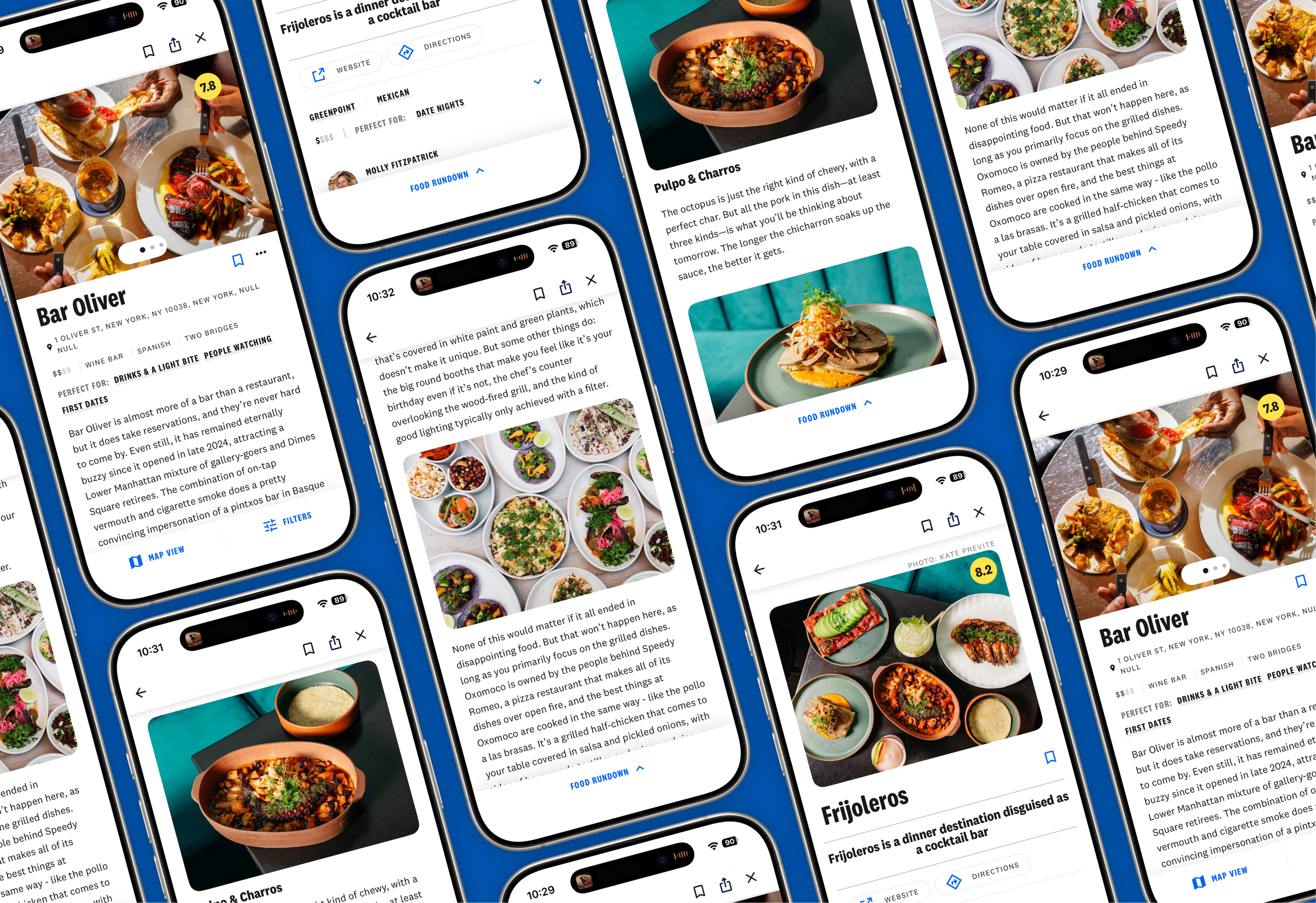
The redesign of guides and reviews focused around creating modular content that can scale. The reason was that modular content can communicate more effectively from editorial staff to the reader. It can accommodate more content, more photos, new videos, and scale for device. Across both Reviews and Guides, the new design introduced scalable layouts, richer media, and flexible structures that made every piece feel intentional, modern, and distinctly The Infatuation.
Reviews Redesign
Building on the research, I set out to make reviews more flexible, visual, and intuitive, a layout that scales to the depth of the story while staying cohesive across desktop, app, and mobile web. After exploring multiple structures and iterations, I landed on a system that adapts dynamically to the content itself. Shorter reviews feel quick and digestible, while longer ones expand with richer visuals and more breathing room.
Ratings were also clarified. Users often didn’t know if a “7.8” was good or bad, or what it represented. The new design introduces an interactive module that explains the rating system and improves SEO by strengthening our E-E-A-T signals around authority and expertise.
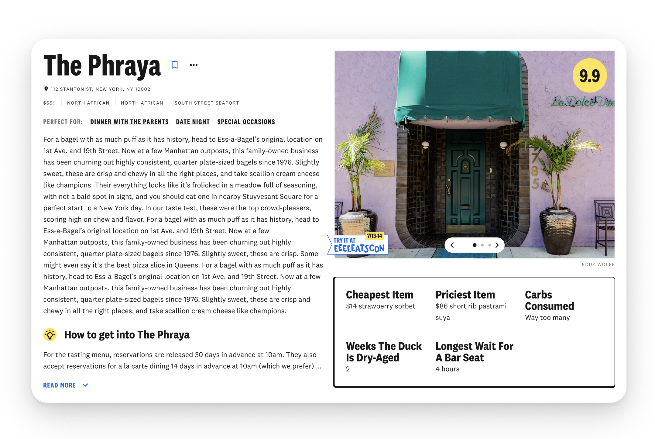
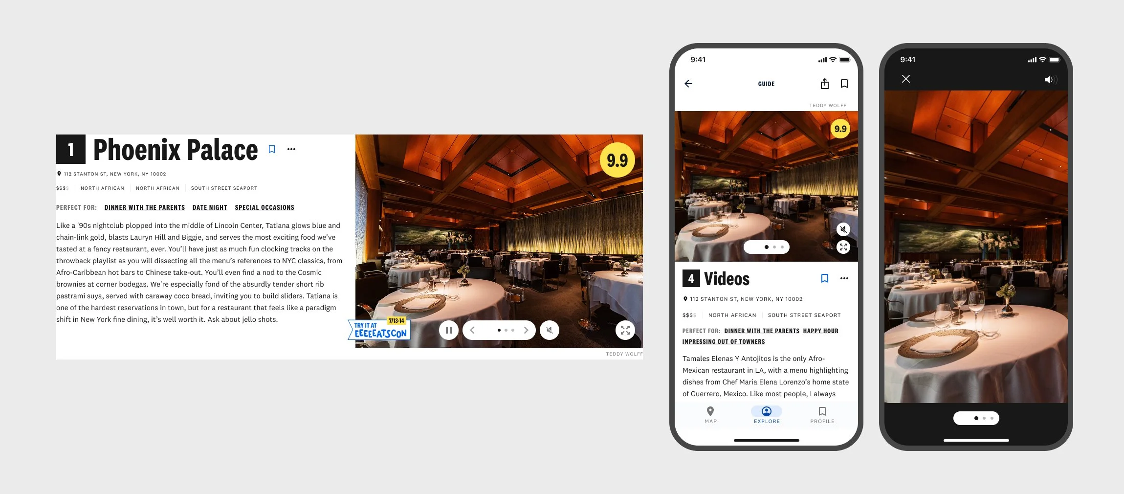
The media experience was completely reimagined. Static header images were replaced with carousels, videos, and GIFs that can appear in-line or open into lightboxes. The result is a more dynamic reading rhythm, a balance of text and media that feels immersive and modern.
Overall, the redesigned reviews feel fluid, legible, and alive, turning static articles into interactive, story-driven layouts that better reflect The Infatuation’s voice.
Guides Redesign
Guides are one of The Infatuation’s most popular formats, but every guide looked the same whether it was The Top 25or Best Coffee Shops to Read At. I created a modular guide system that adapts to the scale and intent of the content, giving editors more control over how stories are told.
The new design introduces small, medium, and large modules that let editors adjust visual weight based on importance. Flagship spots can now take over the page with full-width imagery, while smaller mentions remain compact and scannable. This modularity keeps long guides visually varied and easy to browse, even when they include dozens of recommendations.
I also restructured how metadata appears. Key details like neighborhood, cuisine, and “Perfect Fors” now live directly within each restaurant card improving scanability and helping readers find what they need faster.
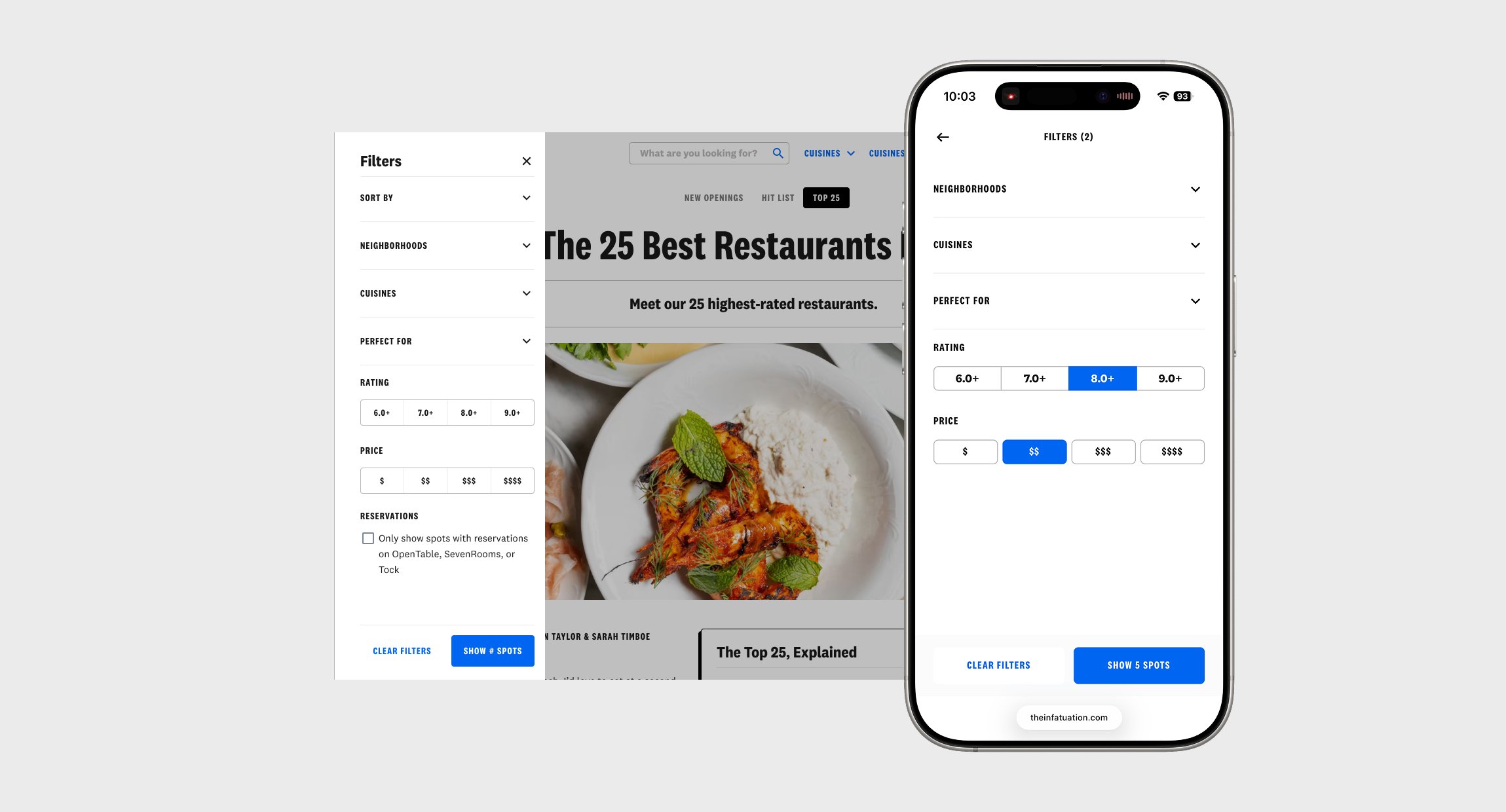
To make larger guides more usable, I introduced sorting and filtering tools that let readers narrow results by location, cuisine, or vibe. The interaction is simple, responsive, and feels native to each platform especially mobile web, where most discovery happens.
The result is a system that balances editorial storytelling with usability, flexible enough for evolving content, but consistent enough to feel cohesive across all platforms.
Sticky Headers
One of the most impactful UX improvements was the introduction of sticky headers across reviews and guides. As users scroll, the restaurant name, rating, save, and share options stay visible at the top of the screen. This keeps critical information within reach at all times and prevents users from losing context, especially during long reads. It’s simple but highly effective, creating a smoother, more focused experience across desktop, app, and mobile web.
Rich Media
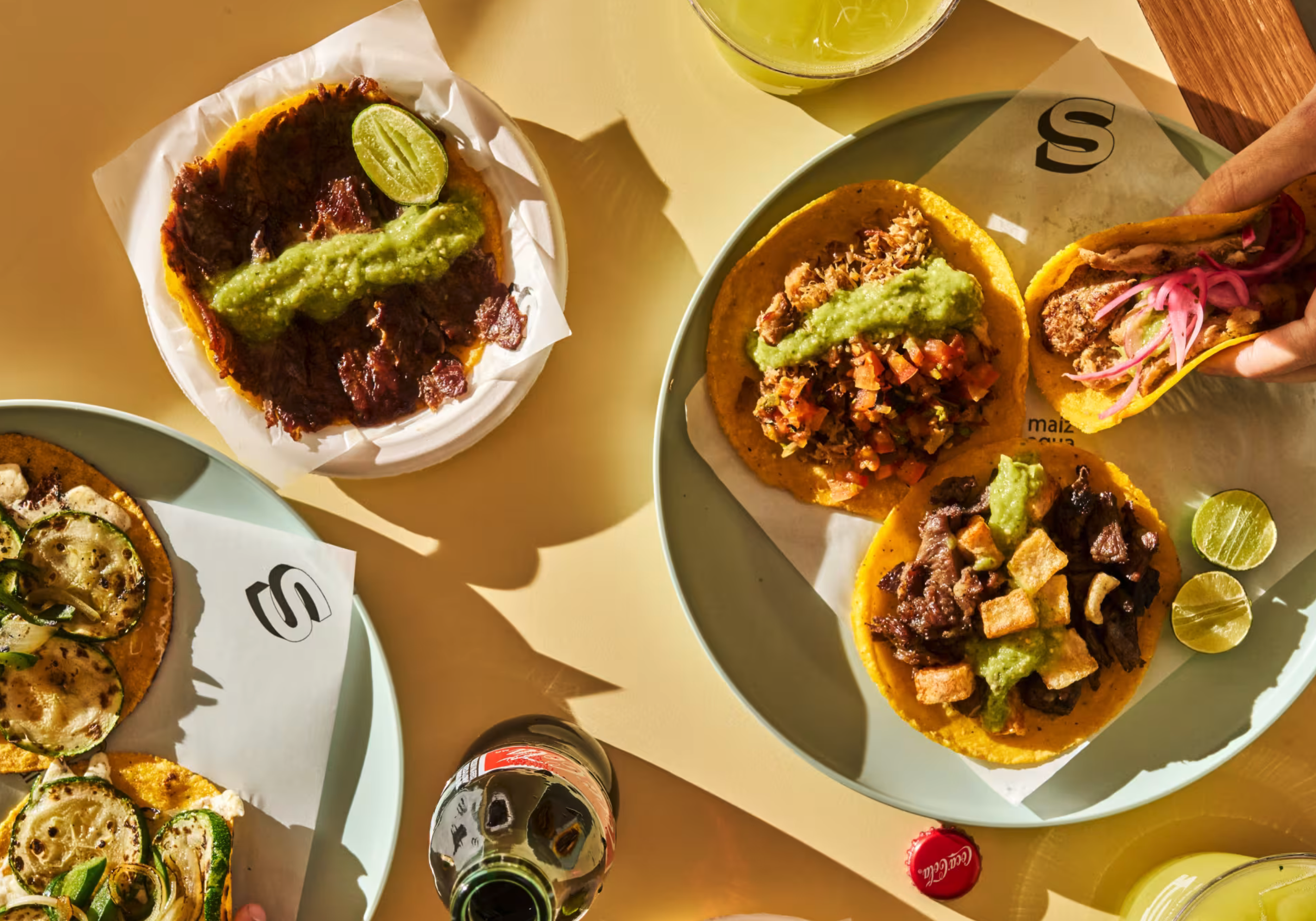
Previously, every review and guide was limited to a single static image. I designed a new media framework that supports carousels, videos, GIFs, and galleries throughout the page. Users can scroll through images, tap into a lightbox for a closer look, or view inline videos that bring the dining experience to life. The goal was to make media feel integrated with storytelling rather than added on top of it.
Sort and Filter
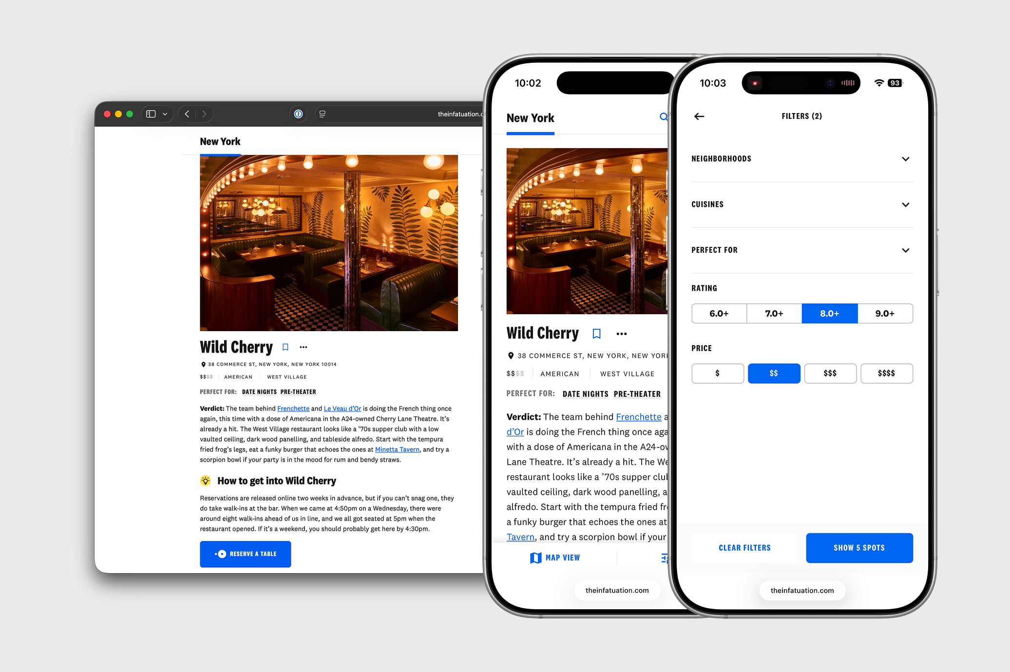
Long-form guides often included dozens of restaurants, making it difficult for readers to find what they wanted. I introduced sorting and filtering tools that let users narrow results by neighborhood, cuisine, and “Perfect For” tags. The filters are intentionally lightweight and responsive, appearing inline rather than as a separate overlay. This makes the experience feel fluid and native to each platform while helping readers find the right spot faster.
Together, these updates redefined how readers interact with The Infatuation. What started as a static, one-size-fits-all layout evolved into a flexible system built for discovery, exploration, and trust. After rounds of iteration, testing, and feedback, we were ready to launch the new experience across desktop, app, and mobile web.
Deliver
I worked closely with my PM, engineering manager, and a small team of engineers and designers to bring the redesign to life. We had a firm deadline to launch before the end of the year to support Year-in-Reviews, one of The Infatuation’s biggest traffic events.
We launched across desktop, mobile web, and app at the same time to ensure parity and a consistent experience. I collaborated with engineers to refine interactions and ensure design fidelity, while the broader design team, and held regular reviews with leadership to align on direction.
To get the editorial team aligned on the new updates, I drafted a 24 page style guide. This helped ensure the editorial team knew how to best use the new modular layouts available to them.
Before launch, I QA'd the experience to check visual and behavioral consistency and ran small user samples to spot issues early. As signals came in, we adjusted layouts, spacing, and metadata to improve readability and flow. Then we followed with A/B tests to compare performance and engagement against the old experience. The data showed stronger interaction rates and better readability, confirming that the new design improved both user experience and SEO.
The Year-in-Review launched to overwhelmingly positive feedback from both readers and the internal team. It became the most engaging experience The Infatuation had ever produced, incorporating the richest mix of media, storytelling, and interaction in the company’s history.
Learnings
Redesigning The Infatuation’s core experiences was far from simple. I navigated personal challenges, changes in leadership, and multiple layoffs along the way. The product that shipped was the result of persistence and collaboration, and I’m proud of what the team accomplished.
In hindsight, a more iterative approach and closer cross-functional alignment could have helped us ship even more. While many of our goals centered around improving SEO, the rise of AI summaries ultimately reshaped how people discover content. Looking back, I wish I had spent more time designing for the human reader rather than for the algorithm.
Still, the work was an invaluable reminder that even under shifting priorities, thoughtful design can create lasting impact — for both teams and the people using what we build.
👋 Let’s connect!
You can contact me using the form here, or email me directly at:
Hello.WillPay@gmail.com

